Usability has finally reached the threshold where one might expect any company building a new product to consider how their product will be used. At the same time more and more companies realize that their expertise in the technology might not be enough in making their products as simple as it ought to be. This is great news for the field of designing for users.
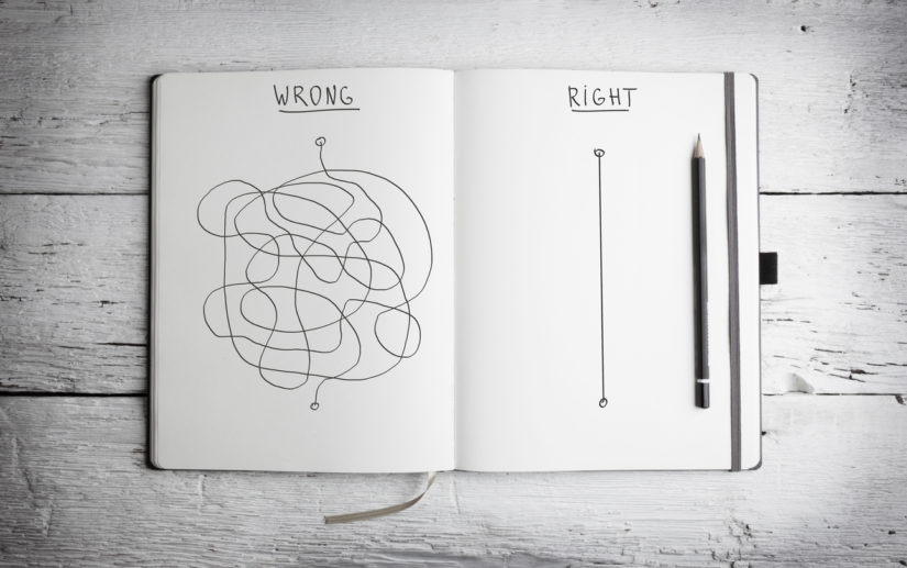
This progress in understanding has created a new interesting situation: many of our clients tell me to make their product “as simple to use as possible”. It sounds logical to want everything to be as simple and easy to use as possible; but is it possible that simplicity has become the new barrier blocking us from seeing the bigger picture?

Simplicity as the enemy
To help you grasp the problem let’s consider the following: a game of bowling. Probably the most common form of bowling is the one where you have 10 pins to knock down. They are positioned at the end of a lane and you roll a heavy ball and try to hit as many as possible. You know what I mean.
Now how do you make the game as simple as possible?
Obviously by removing the lane and positioning the pins in front of the player, making the ball as light as possible that it is still able to knock down the pins, not forgetting an ergonomic handle attached for maximum comfort. You might even consider changing the material of the pins to something more prone to fall over.
Sounds fun? Yeah, not so much. Sometimes the key isn’t making things as simple as possible. Occasionally people even enjoy a challenge as we can see in so many sports.
Balance between simplicity and enabling
Most of the time technology is about enabling people to do new things, be it things they couldn’t do or relieving them of things they had to do before. Now that simplicity has become the new norm in experience development, engineers are slowly transitioning from “how do you make it as simply as possible?” to “how do you make it as simple as possible?”. It isn’t hard to see how this transition makes sense to most engineers as they pride themselves in logical thinking.

The next gap is much bigger. In order to achieve maximum positive experience, we can’t rely on just one aspect (time saving and minimum effort), we need to consider all the other aspects as well. Complicating it all, we humans think of ourselves as logical beings, but we are everything but logical when it comes to our everyday lives.
None of us wants to waste time, yet we spend hours on end consuming what we call “entertainment”. Most of us want fast access to that entertainment, but we usually won’t accept the one that is easiest to access (e.g. browsing through TV channels to find “something to watch”).
Sometimes we need to ask help from others, but if the help comes too easily, we usually feel that something is missing, because the problem felt greater.
Most of the time, in order to feel satisfied, we humans need to apply enough effort to make it feel like we did something, but not too much to make it feel effortful. To make it a bit more confusing, sometimes we won’t be satisfied before we’ve really challenged ourselves. To make matters worse, if we don’t expect something to include effort, we will be extremely unhappy if it is even slightly effortful.
So how do you fill this gap?

Next stop – user experience and interaction design
When it comes to making things simple to use, we talk about usability. When we want it to be pleasant to use, we usually talk about user experience design. Instead of designing for simplicity or “the wow effect” user experience design is actually about figuring out everything indirectly involved with using the product. It is about designing for the “human side” of users.
With user experience in mind we can consider how it affects interacting with the product and thereby we engage in what is called interaction design. It is the concentrated effort in designing specific ways of interacting with products (e.g. special controls).
To get to the next phase in user satisfaction it is sometimes necessary to design more steps than are needed for the completion of a task. A good example is a confirmation dialogue when purchasing something. You wouldn’t want to accidentally buy something, so you won’t complain about being prompted twice to confirm buying a non-refundable service. Instead you can probably imagine a frustrating situation where you accidentally buy something that you didn’t want to, because the system didn’t ask for a confirmation.
Nowadays a confirmation dialogue or other confirmation prompts are a rather standard procedure thanks to years of data collected from users. Regardless of the former statement, it is always a good idea to consider the users and their expectations for any specific service. Sometimes the user expects to confirm via bank confirmation, sometimes it is enough to charge from their prefilled credit card details. We all know which is simpler, but which one are you more comfortable with when purchasing from a new unfamiliar shop?
Next time you want the simplest available product, also remember to ask for something the users actually want.
